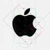
I guess I don’t know how this works. For example: how do you determine where the 8-circles go. Oh, I see, three of them rest on each other at the top. But what about the 8 that intersects with the other 8 to form the leaf? What’s going on there? It looks like it’s bisected by the pink rectangle but not by the green and the circumference doesn’t rest on any of the lines. Do you just move it along the pink line until you’re happy with the way the leaf looks?
And what’s going on with 13 there? Is it supposed to define the height of the apple? If so, why is it a little taller than the height-through-center? Maybe it’s the guide by which to align the 1, 2, 3, 5 and 8-circles around the… and where did those two blue lines come from?
I get where the proportions come from but I’m dumb about this application. But this picture of the Laon Cathedral and this article about modern logo designs that use the ratio makes sense.
Again, I’m dumb about this and open to explanation.
UPDATE: And because there’s no source listed, I can’t email the person that’s making this stuff up.
It isn’t entirely bullshit. The sizes of the squares in the golden spiral (the pink thing) are elements of the Fibonacci sequence: 1, 2, 3, 5, 8, 13. And the radii of some of the circles from which the apple is constructed follow this sequence, apparently. Looks like the 13-circle was fudged a bit, but it’s close.
But the pink overlay in this diagram makes no sense whatsoever. It doesn’t circumscribe or bisect or in any way relate to anything else. The green rectangle is a golden ratio, but I guess you’re supposed to ignore the fact that it doesn’t match the width of the image. And the blue lines don’t serve any purpose at all.
No, this is just a minor observation about a few carefully selected proportions in the Apple logo dressed up to look profound. Sorry to disappoint.