**Subscribe to the 99% Invisible podcast in iTunes or the podcatcher of your choice.**
If you’re not from California, or missed this bit of news, the University of California has a new logo. Or rather had a new logo. To be more precise they had a new “visual identity system,” which is the kind of entirely accurate but completely wonky description that gets met with sarcastic eye rolls from anyone who isn’t a designer, but there it is. But they don’t have a new
anythinglogo anymore. Because of a massive public backlash, the UC system actually suspended theentire new brand identitymonogram while we were reporting this story.In this episode, we talk to the Creative Director of the UC Office of the President, Vanessa Correa, who led the team that created this short-lived brand identity and Christopher Simmons, principal of MINE, who waded into the UC logo fight with a brilliant blog post called “Why the UC Rebrand is Better Than You Think.”
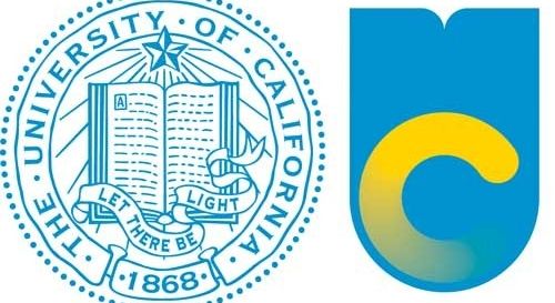
One of the factors that contributed to the negative public reaction was that fact that the UC monogram was often depicted side by side with the classic University seal in media reports.
Christopher Simmons argues that this image, and the general ignorance of the press, implied that the UC monogram was replacing the seal. Actually, the seal was not going anywhere, but this fact was not always clear. And even if the text was accurate regarding the logo’s relationship with the seal, the visual language of the juxtaposition cemented people’s expectations instantly. The blog Brand New depicted a more accurate representation of the visual identity evolution.
Another piece of the marketing that misled the public was the University produced video that graphically illustrated some of the design elements in the monogram being pulled out of the seal, followed by the old seal being brushed aside. As a stand-alone statement, the video reinforced a lot of the fears that people had about the new logo and what it might replace.
Fourth generation UC Berkeley alum, Cyrus Farivar (see episodes #36 and #55, true believers) takes a look at the new UC logo and chronicles its tumultuous life and rapid death. We also use this opportunity to ruminate on the topic of how and when a design should be judged.
Important clarification from Vanessa Correa: “To be entirely accurate, the university didn’t suspend the entire new brand identity, but rather, just the monogram. (I’ve become a stickler for accuracy as of late. It’s a new thing with me.)” I’m embarrassed by the error.