Non-Entry for the MBTA “New Perspectives” Map Challenge
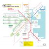
I love the idea of re-designing Boston’s clunky quasi-decipherable Rapid Transit Map. When I heard that the T was putting together a contest to re-design the map I seized the opportunity. I spent the weekend tweaking Bezier curves and aligning dots (so many damn dots), using references like Google maps and subway maps from around the world and came up with this.
Notably absent from the current map is any green space or any of evidence that humans live and work here. Olmsted’s parks have the decidedly un-manly name of “The Emerald Necklace” which I why I suspect they is absent from the current map. The parks really are a treasure though, and some believe that Franklin Park is Olmsted’s masterpiece trumping his more famous Central Park in New York. ( I confess that I have never been there, though I try to ride my bike to the Arboretum every summer). I did my best to tweak the parks’ geography to the rigidity of the map, as well as keeping them to scale with the Common and Rose Kennedy Greenway.I named relevant waterways and some government buildings and landmarks. The choice not to overdo it with too many of them is a conscious one. The downtown region where all the lines meet is busy enough already that I simply could not include certain important landmarks. Also, station names that match locations like “Museum of Fine Arts” and “Aquarium” already do the job.The handicap accessibility symbol is necessary but also robs any map of rhythm and intent. My work-around was to create descriptive keys for each major lines listing the sub-lines and their teminuses (termini?) with a statement identifying stations that do not have accessibility. The Red Line only has one non-accessible station, the Blue Line -two. The Silver and Orange Lines have access to all of their stops. I feel this solution is an aesthetically stronger choice than to have the symbol at every accessible stop.The Green Line, however, requires such identification because the inaccessible stops outnumber the accessible ones. I’m not sure how ADA-compliant my idea is in the real world.Also, naming all of the stops on the Green Line became important. Easy enough to do with the C, D, and (especially) the E lines. The B-Line with its super long names and 19(!) stops proved a challenge. I’m guilty here of omission and abbreviation (The “Griggs St/Long Ave” stop is now just “Griggs St”) but -hey- the T really should shorten those names. While they’re at it, they should eliminate some stops if they can.
I also took liberties with the names of the Silver Line, um, lines. “S1” simply fits better on a map than “SL1”. Personally, I think it looks better too and is potentially less confusing for the commuter.
So there it is… I would say that its kind of a love letter to this place that I have lived in for 12 years, but that’s over-stating it. It was just wicked fun.
Creating something and then surrendering copyright is tantamount to Work for Hire. With this contest, the T wants Work for Hire… for Free. Even the perpetually cash-strapped T can throw a bone to graphic designers that need to put in at least a weekend of work to make something look decent. If they really, really wanted designers to care, they could put some meat on that bone. I ride the commuter rail 4 days a week… I’ll take a yearly pass. I’m not alone in thinking this. In fact, American Institute of Graphic Arts points out that designers should never provide anything of value if they are paid nothing of value. So, T… pay for quality graphic design. Oh, and get rid of “forward funding” to finance yourself. That’s just common sense.
